
Back to Blog
Master Risk Adjusted Returns Calculation
Go beyond basic APY. Our guide to risk adjusted returns calculation teaches you to use Sharpe and Sortino ratios to make smarter investment decisions.
Oct 21, 2025
generated
When you're hunting for yield, it's all too easy to get tunnel vision. The only thing that seems to matter is that big, flashy Annual Percentage Yield (APY) number. But just chasing the highest APY is a rookie mistake, and frankly, it's a recipe for getting rekt.
A proper risk adjusted returns calculation is the only way to actually compare two different opportunities. It forces you to answer the most important question: are the returns I'm getting truly worth the risk I'm taking on?
Why Raw Returns Don’t Tell the Whole Story
In the wild west of DeFi, a protocol screaming about a 15% APY will always grab more eyeballs than one quietly offering a steady 10%. On the surface, the choice seems obvious. But this is a dangerously shallow way to look at things, because it completely ignores the elephant in the room: risk.
Raw returns are just one piece of a much bigger puzzle.
Imagine you're looking at two stablecoin yield farms. Farm A is the one with that juicy 15% APY, but its value swings like a pendulum, hitting incredible highs and then plunging into terrifying lows. Meanwhile, Farm B offers a more "boring" 10% APY, but its growth is as steady and predictable as a Swiss watch.
Someone just chasing the headline number would pile into Farm A without a second thought, completely unaware of the gut-wrenching volatility and potential losses they've just signed up for. This is exactly why we need to think in terms of risk-adjusted returns—it’s not just about what you make, but about the sleepless nights and downside you have to endure to make it.
The Problem with a Narrow Focus
Fixating only on yield means you're blind to the real factors that make or break an investment strategy. You're ignoring things like:
Volatility: How much does the investment's value jump around? High volatility can lead to nasty, unexpected losses, even with a high average return.
Downside Risk: This is all about the potential for things to go south. An investment might look great on average but have a nasty habit of taking huge dives.
This infographic paints a pretty clear picture. It shows two DeFi yield farms, highlighting how that higher APY often comes with a much bumpier ride.

You can see the jagged, unpredictable line of the high-yield farm compared to the smooth, steady climb of the lower-yield one. This is exactly why risk assessment is so critical. A solid risk-adjusted return calculation is the tool that lets you see past the marketing hype and make smarter, more sustainable decisions.
Of course, before you can measure risk-adjusted performance, you need a solid grasp on how to calculate portfolio returns in the first place.
The smartest investors don’t chase the highest possible return; they seek the best possible return for the least amount of risk. This mindset shift is fundamental to long-term success.
Before we get into the nitty-gritty formulas, it helps to have the basics down. If you need a refresher, our guide on how to calculate investment returns is a great place to start. It'll set the stage for the more advanced metrics we're about to jump into.
Calculating The Sharpe Ratio Step by Step
Let's dive into the Sharpe Ratio, probably the most famous metric out there for measuring risk-adjusted returns. It's the industry standard for a reason: it gives you a clean, straightforward way to see if your returns are actually worth the volatility you're putting up with.
The formula can look a bit intense at first, but it's really quite simple once you pull it apart.
The whole idea is to measure how much return you're getting above a risk-free baseline, and then divide that by the total volatility of your investment. It answers a simple question: "For every unit of risk I took on, how much extra return did I actually get?"
Decoding The Formula
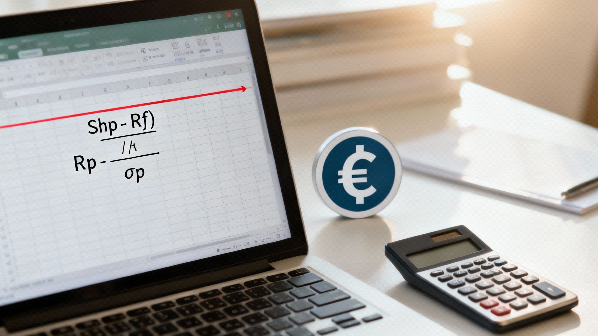
The classic formula is: Sharpe Ratio = (Rp - Rf) / σp
So, what do these letters mean when we're talking about a DeFi stablecoin strategy? Let's break it down.
Rp (Portfolio Return): This is just the average return of your strategy over a set period. For a stablecoin yield farm, you could calculate this using the daily or weekly APY data you pull from the protocol's dashboard or API.
Rf (Risk-Free Rate): This is what you could earn on an investment that's considered virtually risk-free. In traditional finance, this is usually the yield on U.S. Treasury bills. In the DeFi world, you might use the lending rate from a battle-tested, overcollateralized protocol like Aave as a solid proxy.
σp (Standard Deviation of Portfolio): This is the part that sounds like a scary math final, but it's really just a measure of volatility. It tells you how much your returns bounce around their average. A high standard deviation means your returns are all over the map, while a low one means they're nice and steady.
Gathering Your Data
To actually run this calculation, you need to grab some historical data. While the pros in TradFi often use at least 36 months of data, things move a lot faster in DeFi. Using daily returns over a 90-day period is often a more realistic approach for a new strategy.
First, you'll need the daily returns of your stablecoin strategy. You can usually find a way to export this from the platform's analytics page.
Next, you need a good risk-free rate. Let's say the 3-month U.S. T-bill rate is 4.5% annually. To use it in our calculation, we need a daily rate, which would be 0.0123% (simply 4.5% / 365).
The Sharpe Ratio, which William Sharpe cooked up back in 1966, measures this excess return per unit of volatility. The standard deviation (σp) is found by calculating your average return, seeing how far each daily return deviates from that average, squaring those differences, averaging them out, and finally, taking the square root. If you want a deeper dive into the traditional finance side of things, this guide on risk-adjusted returns is a great resource.
To make this crystal clear, let's walk through a quick example.
Sharpe Ratio Calculation Example for a DeFi Strategy
Here's a simplified look at the data you'd need and how it plugs into the formula for a hypothetical stablecoin yield farming strategy over 90 days.
Metric | Symbol | Example Value | Description |
|---|---|---|---|
Average Daily Return | Rp | 0.0411% | The mean daily return of your stablecoin strategy over 90 days. |
Daily Risk-Free Rate | Rf | 0.0123% | Based on an annual 4.5% U.S. T-bill rate, divided by 365. |
Daily Standard Deviation | σp | 0.0192% | A measure of how much your daily returns fluctuated. |
Sharpe Ratio (Annualized) | - |
| ((0.0411% - 0.0123%) / 0.0192%) * sqrt(365) = 1.5 |
We annualize the final number by multiplying by the square root of the period (365 for daily data) to make it comparable with other investments.
Interpreting The Results
Okay, so you've crunched the numbers and have a final figure. What does it actually mean?
A Sharpe Ratio above 1 is generally considered good. It means you're being well-compensated for the risk you're taking. A ratio below 1 suggests the returns might not be worth the volatility, and a negative ratio means you would have been better off just holding a risk-free asset.
For instance, if your DeFi strategy has a Sharpe Ratio of 1.5, it's generating 1.5 units of return for every unit of risk.
Now, imagine you're comparing it to another strategy that has a ratio of 0.8. Your strategy is significantly more efficient from a risk-adjusted standpoint, even if its raw APY is a tiny bit lower. This single number helps you move beyond just chasing high yields and into making smarter, more informed decisions.
Exploring Nuanced Metrics Like Sortino and Treynor
While the Sharpe Ratio is a fantastic starting point, it has one major quirk that can sometimes paint a misleading picture. It lumps all volatility together, penalizing a strategy for a massive, unexpected pump just as much as it does for a gut-wrenching drop.
But let's be real—most of us welcome those surprise green days. It's the sudden losses that keep us up at night.
This is where more specialized tools come into play, giving you a much sharper lens to calculate your risk-adjusted returns. By going a layer deeper than Sharpe, you can start matching your analysis to what you actually care about, which for many is preserving capital and dodging those brutal drawdowns.
Focusing on What Matters with The Sortino Ratio
The Sortino Ratio is a brilliant tweak on the Sharpe Ratio that zeros in on this exact problem. Instead of using total volatility (standard deviation) as the risk measure, it only uses downside deviation.
Put simply, it only cares about the "bad" volatility.
It completely ignores the days your strategy shot up unexpectedly and only penalizes it for the days it fell short of a minimum acceptable return. This makes it an incredibly useful metric for anyone whose main goal is capital preservation.
The question it answers is far more specific than Sharpe's: "For every unit of harmful risk I took, how much extra return did I actually get?"
Let's go back to our DeFi stablecoin strategy. It had a solid Sharpe Ratio of 1.5. But what if most of its volatility came from days where yields spiked unexpectedly? The Sharpe Ratio actually punishes it for those great days.
Running the numbers for the Sortino Ratio might give us a score of 2.1. That higher figure tells a much more compelling story: the strategy is even more efficient at generating returns when you only factor in the risk of actual losses.
When to Use The Treynor Ratio
While Sortino refines our view of volatility, the Treynor Ratio looks at risk from a totally different angle. It’s built for portfolios that are heavily swayed by the wider market—think a bag of large-cap crypto assets like Bitcoin and Ethereum.
Instead of measuring total volatility, the Treynor Ratio compares returns to systematic risk, which is just another way of saying "market risk." This is captured by a metric you've probably heard of called beta.
A beta of 1 means your asset tends to move in lockstep with the market.
A beta greater than 1 means it's more volatile than the market.
A beta less than 1 suggests it's less volatile.
The Treynor Ratio is perfect for figuring out if a fund manager is earning their fees in the stock market. For our DeFi stablecoin example, though, it’s not the right tool for the job. Why? Because a stablecoin's value is specifically designed not to correlate with the broader crypto market's wild swings.
A savvy investor knows which tool to use for the job. For a stablecoin strategy, Sortino tells you about downside protection. For a diverse crypto portfolio, Treynor might reveal how it performs relative to the market's swings.
Beyond just Sharpe, these different metrics give you different lenses to evaluate performance, a common practice in major global markets. The Sortino Ratio fine-tunes the analysis by punishing only harmful fluctuations. Meanwhile, the Treynor Ratio is key for assessing returns against market risk (beta), making it super useful in frameworks like the Capital Asset Pricing Model. You can find more great insights on these risk evaluation methods on wallstreetprep.com.
Ultimately, picking the right metric comes down to your strategy and what kind of risk you care about most.
Putting These Metrics Into Action
Knowing the formulas is one thing, but actually using them to make smarter investment choices is the real prize. This is where you move from theory to a tangible strategy, creating a consistent process for evaluating opportunities that transforms your approach from reactive to disciplined.
Let’s walk through a common scenario. Imagine you're comparing two different DeFi stablecoin strategies. At first glance, you might just pick the one with the highest advertised yield. But when we apply our new tools, the smarter option often becomes crystal clear.
A Tale of Two Strategies
Let's look at a side-by-side comparison.
Strategy A: A newer, more aggressive protocol dangling a tempting 12% APY.
Strategy B: A more established, battle-tested platform with a modest 8% APY.
Someone just chasing raw numbers would jump on Strategy A without a second thought. But what happens when we dig just a little deeper?
Comparing DeFi Strategies Using Risk-Adjusted Metrics
Here's how the numbers really stack up when you look beyond the headline APY. This simple table shows why the "boring" option is often the better bet.
Metric | Strategy A (High Yield) | Strategy B (Moderate Yield) |
|---|---|---|
Reported APY | 12% | 8% |
Sharpe Ratio | 0.75 | 1.60 |
Sortino Ratio | 0.90 | 2.25 |
Conclusion | Poor returns for the risk | Excellent returns for the risk |
The data paints a completely different picture, doesn't it?
Strategy A’s low Sharpe Ratio of 0.75 is a major red flag, signaling that its high returns come with punishing volatility. The Sortino Ratio of 0.90 confirms it—this strategy offers very little protection against those nasty downside swings.
On the other hand, Strategy B’s Sharpe Ratio of 1.60 is fantastic. It shows the protocol is highly efficient at generating returns for the total risk involved. Even better, its stellar Sortino Ratio of 2.25 tells us it's exceptionally good at protecting your capital from losses.
Suddenly, that "boring" 8% APY looks like the far superior investment. It’s not just about what you earn; it’s about how bumpy the ride is to get there.
Creating Your Investment Framework
To actually bake this thinking into your process, you need to set some clear benchmarks for your portfolio. This isn't about being rigid; it’s about being intentional.
Here’s a simple way to start:
Set Minimum Ratios: Establish a baseline for any new investment you consider. For example, you might decide to ignore any strategy with a Sharpe Ratio below 1.2 or a Sortino Ratio under 1.8. This acts as an effective filter, immediately weeding out overly risky or inefficient opportunities before you waste any more time on them.
Use Metrics for Rebalancing: These numbers aren't static. If you notice a position's Sortino Ratio has been steadily declining, that's a sign its risk profile might have changed. It’s a trigger to re-evaluate your allocation and decide if it still has a place in your portfolio.
Remember Their Limitations: This is crucial. Always remember these calculations are based on historical data. Past performance is a helpful guide, but it's never a guarantee of future results. Think of these metrics as tools for making better-informed bets, not crystal balls.
The ultimate goal is to move beyond simply asking, "How much can I make?" and instead ask, "How much am I earning for every unit of risk I'm taking?" This shift in perspective is what separates successful long-term investors from short-term speculators.
By consistently running these calculations, you turn abstract data into actionable intelligence. This ensures every decision you make is grounded in a clear-eyed assessment of both risk and reward. And if you want to make sure your starting numbers are solid, our guide can help you correctly calculate APY before you even begin your risk analysis.
A Look at Real World Performance
Calculating risk-adjusted returns isn't just some abstract theory we cooked up for DeFi. This is a battle-tested tool that has been the absolute cornerstone of institutional finance for decades. Asset managers, hedge funds, and professional investors don't just chase raw gains; that's amateur hour.
They live and die by their ability to generate superior returns for the amount of risk they take on. Metrics like the Sharpe Ratio are their primary yardstick.
This obsession with risk really took hold after major market meltdowns. Think back to the 2008 financial crisis. Plenty of high-flying funds had posted incredible returns in the years prior, only to be completely wiped out when the market turned.
The strategies that survived, and even thrived, were almost always the ones with a disciplined focus on risk management. They may not have had the most spectacular gains during the bull run, but their strong risk-adjusted performance meant they preserved capital when the storm hit.
Benchmarking Against The Pros
Looking at historical data from traditional finance gives us an invaluable benchmark for our own strategies, even in DeFi. It grounds our expectations in reality and shows what top-tier performance actually looks like over the long haul. Honestly, this context is critical if you're serious about building a resilient portfolio.
The data on this is well-documented. For instance, detailed studies of U.S. equity mutual funds from 1980 to 2000 showed an average Sharpe Ratio hovering between 0.3 to 0.5 for actively managed funds. This was a bombshell at the time—it revealed that after fees, many funds were barely compensating investors for the risks they took.
More recently, a 2020 analysis of global hedge funds found median Sharpe Ratios closer to 0.8, reflecting more sophisticated diversification and risk management techniques. If you want to go down the rabbit hole, you can explore more of these historical performance metrics on the New York Fed's research portal.
Lessons from Market History
These historical benchmarks prove a critical point: achieving a Sharpe Ratio consistently above 1.0 is exceptional. A ratio of 1.5 or higher puts a strategy in an truly elite category.
So, when you calculate a Sharpe Ratio of 1.6 for your DeFi stablecoin strategy, you’re not just looking at a random number. You’re seeing performance that would be considered top-decile in the world of professional asset management.
This historical perspective is empowering. It shows that the principles of risk-adjusted returns are universal, applying just as much to a brand new DeFi protocol as they do to a decades-old Wall Street fund.
By applying these same battle-tested tools, you elevate your own analysis from simple yield chasing to a sophisticated, professional-grade assessment. It’s all about learning from the hard-won lessons of market history to navigate the unpredictable future with more confidence and discipline, ensuring your portfolio is actually built to last.
Common Questions About Risk Calculations
Once you get a handle on the core formulas, the real-world questions start popping up. It's one thing to understand a calculation in theory, but it's a completely different ballgame when your own capital is on the line. This quick guide tackles the common hurdles I see people face when they start calculating risk-adjusted returns.
Think of these as the practical follow-ups that bridge the gap between knowing the formulas and actually using them to make better decisions. Let's clear up any lingering doubts so you can move forward with your analysis confidently.
What’s the Right Risk-Free Rate for DeFi?
This is a fantastic question and a super common point of confusion. In traditional finance, everyone just defaults to the U.S. Treasury bill—it’s the gold standard. In DeFi, though, the concept is a bit more fluid.
A solid approach is to use the lending rate for a major stablecoin like USDC or DAI on a highly overcollateralized and battle-tested protocol. Think of platforms like Aave or Compound. The yield you could earn there represents a baseline, low-risk return within the DeFi ecosystem itself. That makes it a much more relevant and practical benchmark for your calculations than a T-bill.
How Do I Handle Limited Historical Data?
DeFi moves at light speed. Many of the most promising strategies are brand new and simply don't have the years of data you'd find in TradFi. So, what do you do when you only have a few months of performance history to work with?
With limited data, your results become more of an informed snapshot than a long-term prediction. It's crucial to acknowledge this limitation and probably lean more on the Sortino Ratio, as it can highlight downside protection even over shorter periods.
When data is scarce, here are a few things I do:
Check in more often: I'll monitor the ratios much more frequently to spot any changes in the risk profile as new data rolls in.
Stay conservative: A killer Sharpe Ratio over 30 days is promising, for sure, but it isn't a proven track record. Treat it with a healthy dose of skepticism.
Bring in the human element: Dig into the protocol’s security audits, the team's reputation, and the tokenomics. For more ideas on evaluating different kinds of risk, you can explore various risk assessment methods—while they come from a different field, the core principles are universal.
When Is One Ratio Better Than Another?
Knowing which tool to pull from your toolkit is key. It really all comes down to what you’re trying to measure and what you care about most.
Use the Sharpe Ratio for a general, all-purpose view of efficiency. It's the industry standard and great for comparing totally different types of assets.
Use the Sortino Ratio when your number one goal is capital preservation. It’s hands-down the better metric for understanding downside risk specifically.
Use the Treynor Ratio when you're analyzing a portfolio that's heavily correlated with the broader market, like a basket of large-cap crypto assets.
By picking the right metric for the job, your risk-adjusted returns calculation becomes way more insightful. For a deeper dive, check out our guide on the best practices for risk management to help build out a more robust framework.
Ready to put this knowledge to work without messing with spreadsheets? Yield Seeker uses AI to automatically find and manage high-yield, risk-assessed stablecoin opportunities for you. Start growing your USDC effortlessly at https://yieldseeker.xyz.